As we navigate the vast world of data, it’s becoming increasingly important to create a seamless, intuitive, and efficient user experience. At RXA @ OneMagnify, we’ve been noting a rise in inquiries from our clients who are actively seeking ways to improve navigation for their end-users within the Domo platform.
Why the surge in these inquiries? With the numerous dashboards and a wealth of data that Domo can host, it’s crucial to organize and present a data experience in a way that users can effortlessly comprehend and navigate. This is where the concept of a well-designed table of contents comes into play.
The Power of a Table of Contents
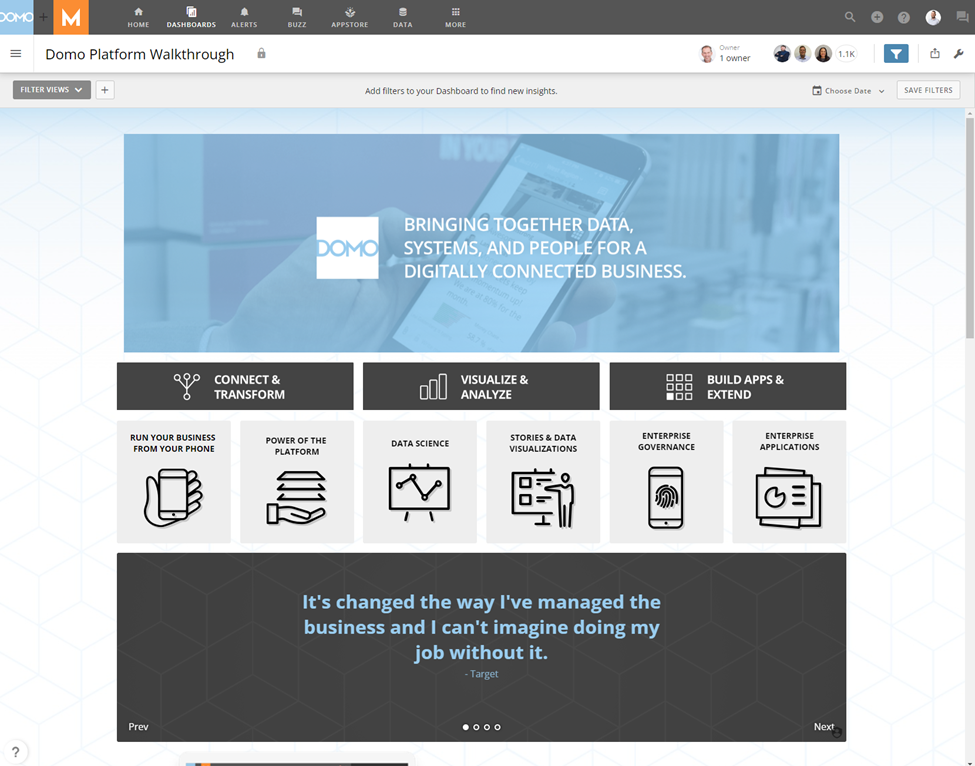
A table of contents provides a structured, user-friendly approach to a data-rich environment. It serves as a roadmap to your dashboards, making navigation significantly more intuitive and user-friendly. The primary purpose is to streamline access to crucial data by effectively categorizing and linking related dashboards. This simple yet potent tool can enhance the overall user satisfaction by simplifying access to critical data.
One such instance is the iPhone’s settings app. It’s a quintessential modern example of an interface that utilizes a table of contents layout to facilitate user interaction. When you open the settings app on your iPhone, you are greeted with a list of categories such as “Display & Brightness,” “Sounds & Haptics,” “Notifications,” etc. This is very much akin to a table of contents in a book, where you can easily look up the section you need without having to flip through every page. You simply tap on the category you want to explore, and you are taken to a new page with additional related options. This kind of organized and streamlined access to critical settings is precisely what a well-designed table of contents in Domo can provide. It guides users to the data they need quickly and intuitively, saving them time and reducing frustration.

Harnessing Domo’s Customization Capabilities
What truly sets Domo apart is its flexibility and immense customization capabilities. These features allow for the creation of a table of contents that is more than just a navigational tool—it can be a custom-built access point to the data most relevant to your business.
The power of Domo lies in its adaptability, enabling users to tailor their experience based on what’s most important to their roles, departments, or organizations. Your table of contents, therefore, becomes a reflection of your business’s unique data needs.
Step-by-step Guide on Designing a Table of Contents
- Understanding User Requirements: First, understand who will be using your Domo dashboards and what kind of information they need. This will help you design a table of contents that’s useful and meaningful to them. There is no one size fits all, a Table of Contents for a large publicly traded company can (and should!) look much different than one for a small business.
- Planning: Draw a rough sketch of the layout of your table of contents. Identify the major sections or topics that you want to include, and decide on a logical order to present them. If possible, think about whiteboarding with a few of your stakeholders.
- Creating Categories: Once you have an understanding of your users’ needs, start by creating categories for your dashboard content. These categories could be based on different departments, functions, data types, or any other logical grouping relevant to your organization. Make sure the categories are clear and self-explanatory.
- Designing Navigation: Within each category, you can have various Apps, dashboards, or card collections. Use clear and concise names for these dashboards and ensure they are arranged logically within each category. If a category has a large number of dashboards, consider creating subcategories or subpages for better organization.
- Creating a Summary Card: For each dashboard, consider creating a summary card which provides a quick overview or key insights from that dashboard. This gives users a snapshot of what to expect without having to dive into the details. Using a Text card with Domo’s Smart Text feature is a great way to pull many metrics into a quick summary.
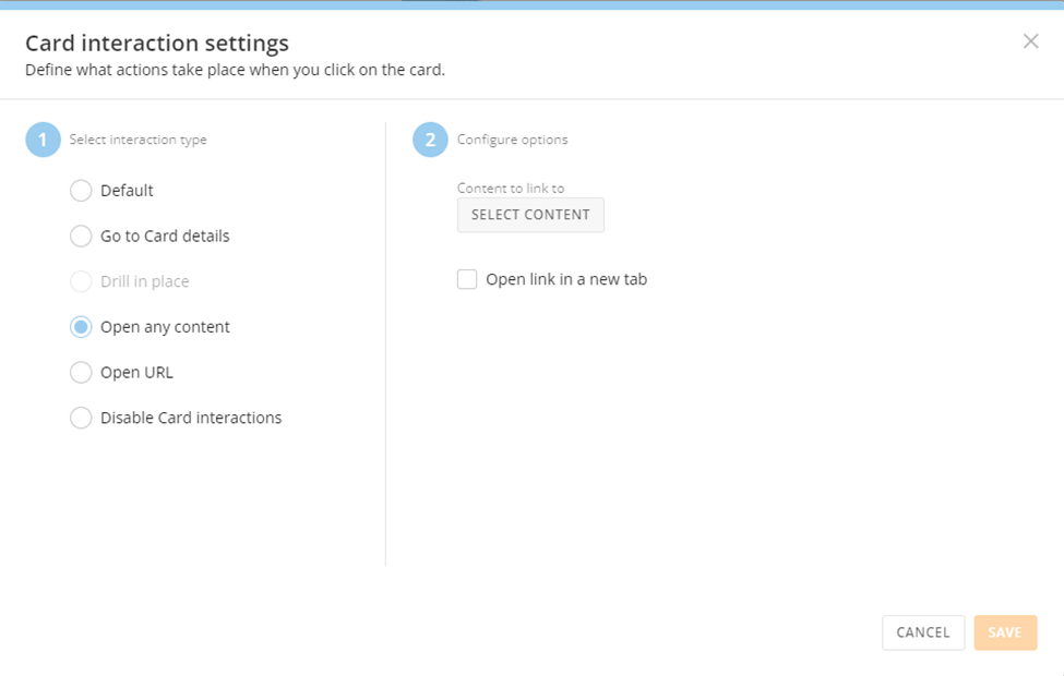
- Linking Dashboards: Use the “Card interaction settings” feature in Domo dashboards to create links from your table of contents to each dashboard. This creates a seamless navigation experience for the users.
- Providing Context: Make sure to provide sufficient context for each dashboard link. This could be a brief description about the data in the dashboard, the time frame, the source, etc.
- Testing: After you’ve set up your table of contents, be sure to test it out. Make sure all links work properly, and that the layout and navigation make sense.
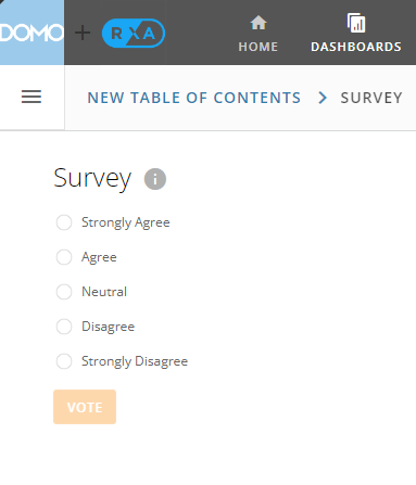
- Soliciting Feedback: Share your table of contents with a few users and get their feedback. Make adjustments as necessary based on their input. This can be done with one of Domo’s Poll cards, linked right inside of the Table of Contents.
- Maintaining and Updating: Once your table of contents is live, make sure to keep it updated. As new dashboards are created, they should be added to the appropriate place in the table of contents. Similarly, if dashboards are removed or updated, make sure the table of contents reflects those changes.
Looking Ahead
As businesses continue to rely heavily on data to drive their decision-making processes, the importance of an organized, user-friendly interface becomes paramount. A Domo table of contents, with its potential for customization, offers a solution to the challenge of navigating vast and complex data landscapes.
In the end, the goal is to make the user experience as seamless as possible. A well-designed table of contents, combined with Domo’s powerful data experience platform, can significantly contribute to this objective.
At RXA@OneMagnify, we’re committed to helping businesses get the most out of their data. We understand the power of an organized, intuitive user interface, and are always ready to assist our clients in harnessing this potential.
About RXA @ OneMagnify
RXA @ OneMagnify is a leading data science consulting company. RXA @ OneMagnify provides data engineers, data scientists, data strategists, business analysts, and project managers to help organizations at any stage of their data maturity. Our company accelerates analytics road maps, helping customers accomplish in months what would normally take years by providing project-based consulting, long term staff augmentation and direct hire placement staffing services. RXA @ OneMagnify’s customers also benefit from a suite of software solutions that have been developed in-house, which can be deployed immediately to further accelerate timelines. RXA @ OneMagnify is proud to be an award-winning partner with leading technology providers including Domo, DataRobot, Alteryx, Tableau and AWS.
Website: https://www.rxa.io
Twitter: @RXAio
LinkedIn: linkedin.com/company/rxa.io