As a Domo partner, we constantly see the power that the Domo platform has to visualize data and bring it to life to tell a story. If you work within the platform, you already know the importance of choosing the right visualizations that take insights and turn them to action, so I won’t turn this into a lecture, don’t worry! What I do have for you is a basic guide for navigating the visualization types that the Domo Analyzer offers, and how to use them to your advantage.
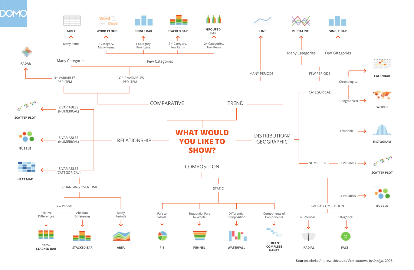
Domo put this chart together to guide visualization choices. It’s a great resource to have on hand!
The basics of data visualization
At a basic level, data visualizations are created to display relationships or distributions within data. There are many options to choose from in Domo, but certain card types tend to work better than others to answer different types of questions. There are a few things to consider when choosing a visualization or card.
The first, and arguably most important, step for card building happens before you open Domo in your browser. We often see companies making cards for the sake of making cards, ending up with jumbled pages that don’t communicate a narrative. To avoid becoming one of our governance use cases down the road, you need to think about the overall business question you are trying to answer before you do anything else. Then you can ask yourself some questions to help direct yourself to the right visualization to answer that question.
- Am I looking at the distribution or composition of one variable?
- Am I looking at the relationship between multiple variables?
- Am I looking for a comparison between multiple variables?
- What timeframe is relevant for this information?
The distribution or composition of one variable
If you are interested in viewing the makeup of one variable, there are a few good options for you. Distribution is often synonymous with frequency and will let you know how often a certain value occurs. The typical chart types for distribution are histograms, which show the available categories on the x axis and the number of values in each category on the y axis. Histograms are available in Domo under the ‘Vertical Bar’ chart type.
Another distribution option is a Boxplot, which shows the dispersion of values for a variable. These plots show the minimum, median, and maximum for each variable in one place. Domo lists these chart types under the ‘Data Science’ bucket.
Finally, you may be curious about the composition of a column of data. Pie charts and pie chart variations, like the donut, treemap, and nautilus are all great options for this. I suggest adding a legend or data label that clearly shows the values and the percentage they represent, since it can be hard to eyeball the area of each component. Bar charts are also great for showing composition, either vertical or horizontal types. You can show the makeup of multiple variables using a stacked, nested, or grouped bar chart, or the composition of one variable with a normal bar chart, pareto, or a percent of total card. These can all be found under the ‘Vertical bar’ or ‘Horizontal bar’ chart categories.
The relationship or comparison between multiple variables
Understanding the relationships between two or more variables is usually done through a comparison or a correlation analysis. Correlations should only be created with columns of data that you know have a relationship. A great correlation card within Domo is the scatter plot, found under the ‘Data science’ category, which shows the relationship between two variables through bubbles. You can also set these up to change the size of the bubbles based on the correlation of a third variable.
Comparisons, also called nominal relationships, can be shown in a variety of ways. Bar charts are one of the cleanest ways to show these relationships by displaying values associated with each variable. Lollipop charts are a variation of bar charts that work relatively the same. You can use either vertical or horizontal variations of these charts, just be sure to label your axis to ensure the viewer knows how the data is represented.
Timeframe considerations
Timeframes can affect how you display data greatly. In most of the chart types mentioned above, time can be one of the variables represented on an axis to determine correlations or comparisons with time, view how composition changes over time, and identify trends. But I wanted to include a few time-specific notes here for common situations you may run into with your Domo work.
If you are interested in seeing what a value is now, or at one given point in time, the ‘Gauges’ charts are for you. A Single Value card will show one aggregation for a column of data, while a Filled Gauge or Progress Bar will allow you to track progress towards a goal. These all display an aggregation for whatever timeframe is selected on the page; for example, a SUM will show the total for that period while a MAX will show the greatest value for that period.
If you are interested in seeing how a value has changed over time in the past, ‘Line’ charts or ‘Area’ charts are great options, and there are several variations that allow you to track one or multiple variables over time. There are even Running Total line charts that automatically calculate the running total for the timeframe selected.
Finally, ‘Period over period’ charts make it easy to compare variables from one timeframe to another and calculate the variance between the timeframes. These can be a bit more complex than other chart types, but Domo has a great writeup on how to use them.
Other types of visualizations
Domo has a few other great chart types that I would like to mention. Tables, including the Mega Table, Pivot Table, and Heatmap table, are very versatile and can be used to display data on a more granular level than other chart types. I find myself using them often to QA datasets or for setting up data to export. Map chart types can be helpful for seeing the distribution of datapoints throughout a geographical area. Maps of major areas are available as presets in Domo’s ‘Maps’ category.
Domo also offers the ability to make custom charts, which can be very helpful if you can’t find quite what you’re looking for and have the technical expertise to create them.
Looking for more Domo training?
RXA is a Domo certified partner and works on all types of Domo training and consulting projects. We love working with clients to help them ask the right questions and find answers within their data. If you are struggling with visualizations or any other aspect of your Domo implementation, we are happy to help! Contact us via our website at https://rxa.io/contact or via email at learn@rxa.io today.