If this isn’t value you want, you either need to filter the card on one of the accounts and build two cards to show the value for each account, or the accounts can be grouped by using a simple Beastmode calculation in Domo that will add both accounts together and use that as the filter:
CASE
WHEN `Account` = ‘Expert Automotive’ THEN ‘All’
WHEN `Account` = ‘National Automotive’ THEN ‘All’
ELSE ‘filter’
END
Now the cost per conversion across both accounts will be displayed at 48.59.
Generally, it’s useful to set up a series of Gauge charts that show a summary of several related KPIs. For example, you can show Clicks, Conversions, Cost, and Cost per Conversion each within a separate Gauge on a summary Dashboard to get a sense of how Paid Search media is performing overall.
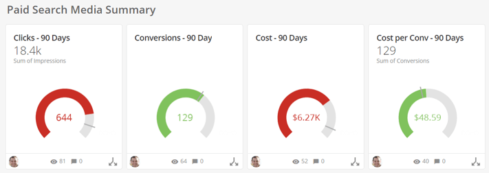
Visually speaking the Gauge chart is pretty basic, but it provides a good launching pad for Dashboards and more detailed visualizations. When used properly, it sets the stage for telling your story about the data and sets the table for deeper discussions about performance.